Logo review
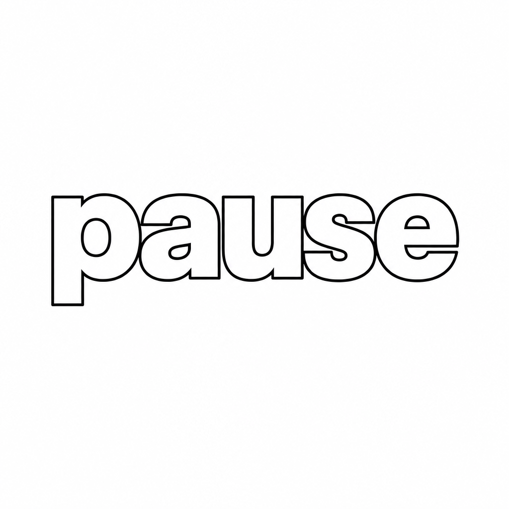
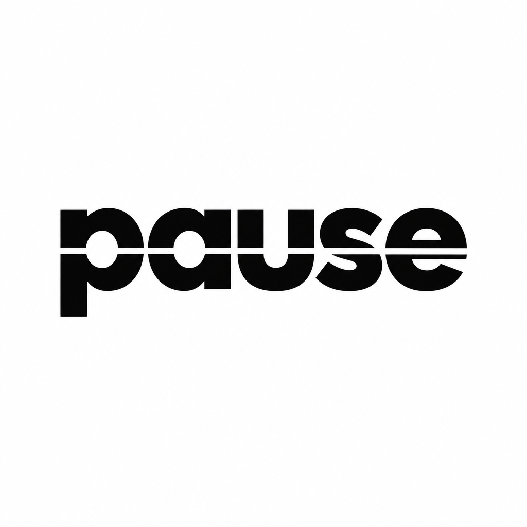
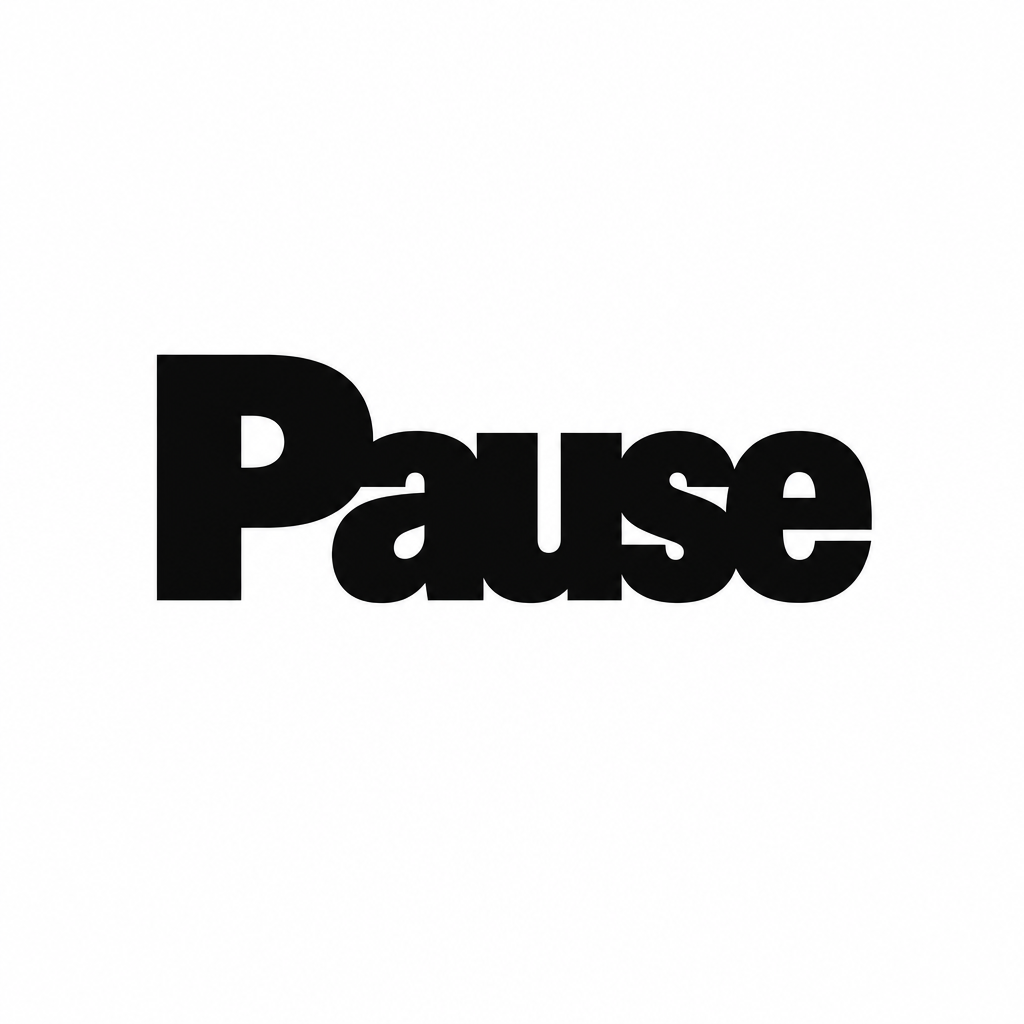
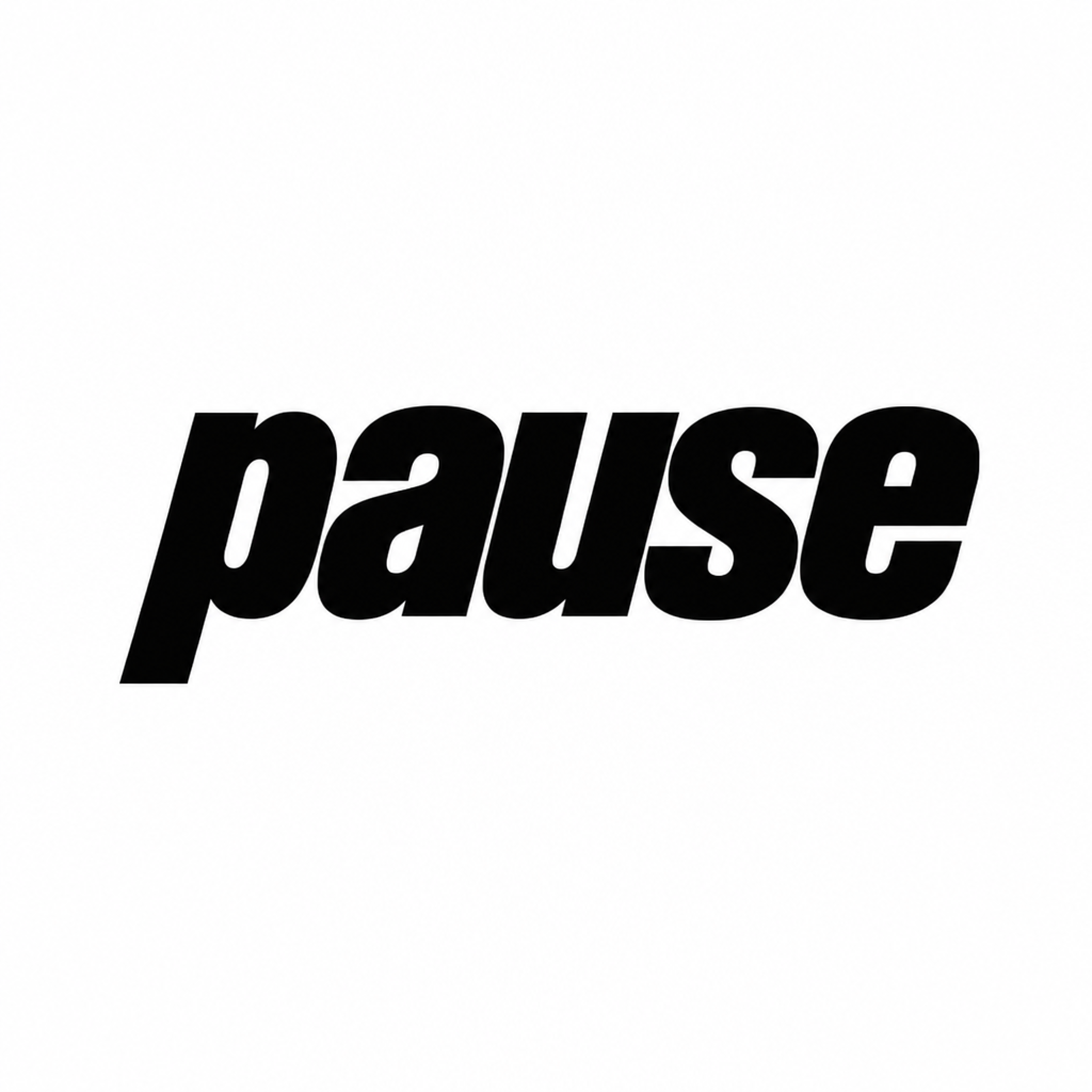
Three finalists, drawn from the stacked lockup you picked out of the mark types and taken into the two other type worlds that were working. Each one is shown with its construction, at the sizes it has to survive, reversed, and as an avatar.
Nothing here is finished artwork. These are generated studies, close enough to judge the idea and the proportion, not close enough to ship. Whatever wins gets drawn properly in vector before it goes anywhere near Amy, Adrienne or BioStation.
12 October 2026 · internal, not indexed
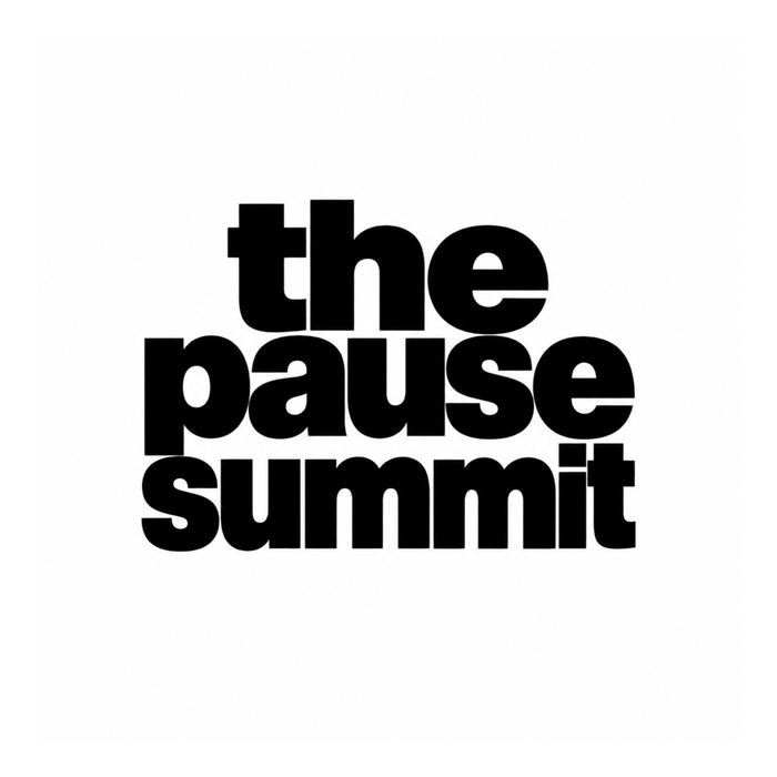
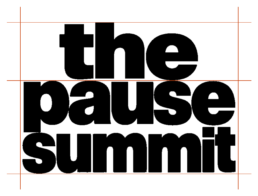
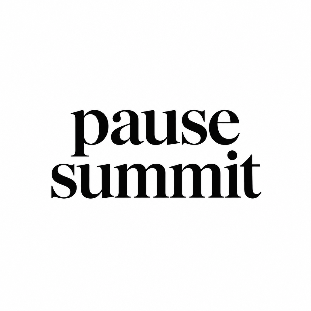
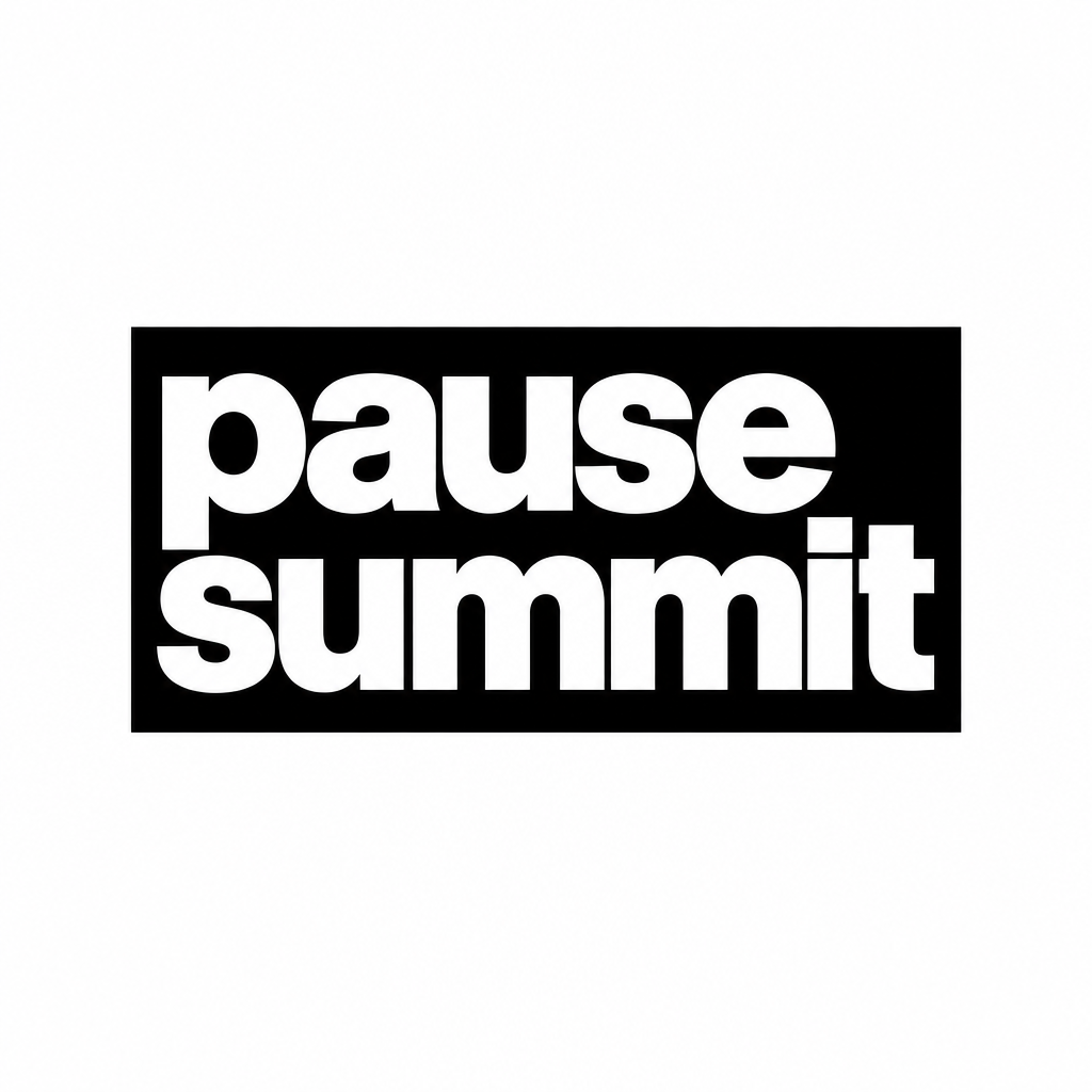
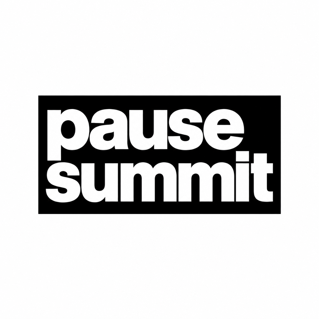
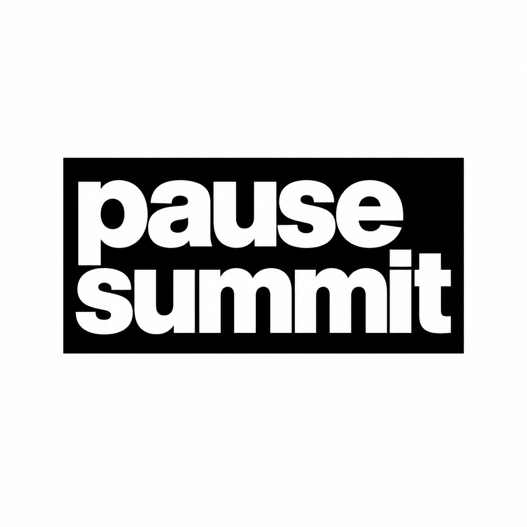
Lowercase block
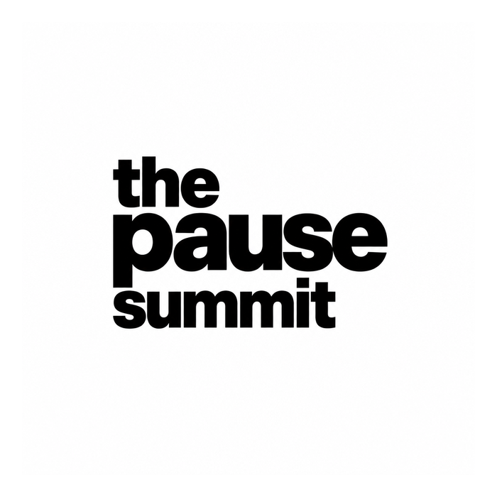
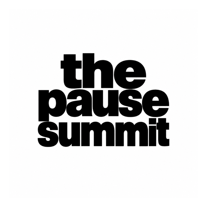
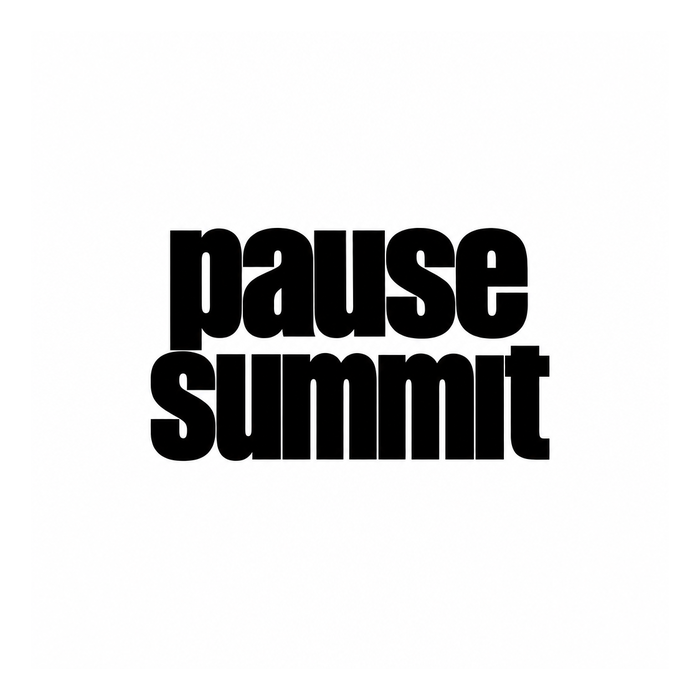
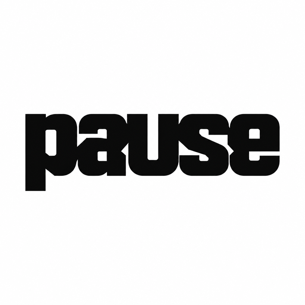
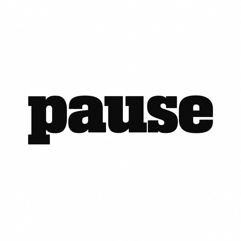
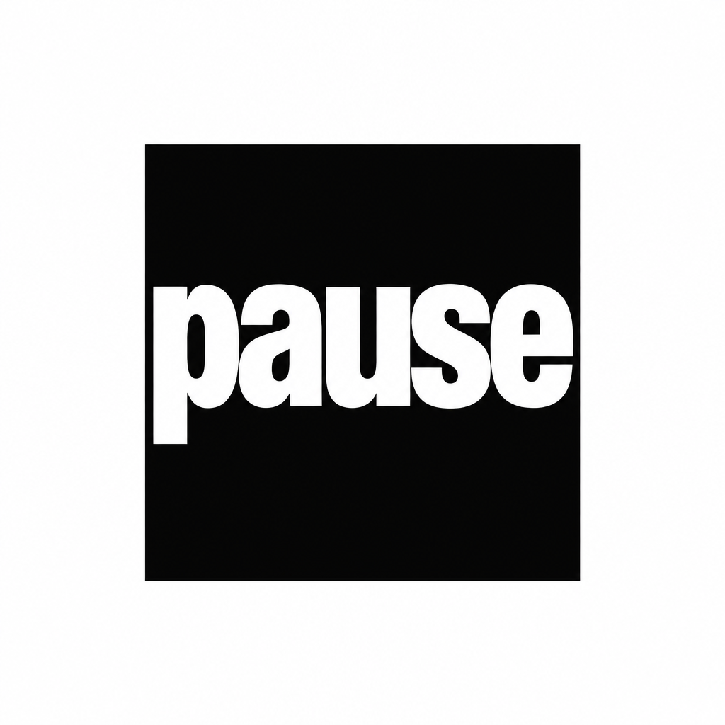
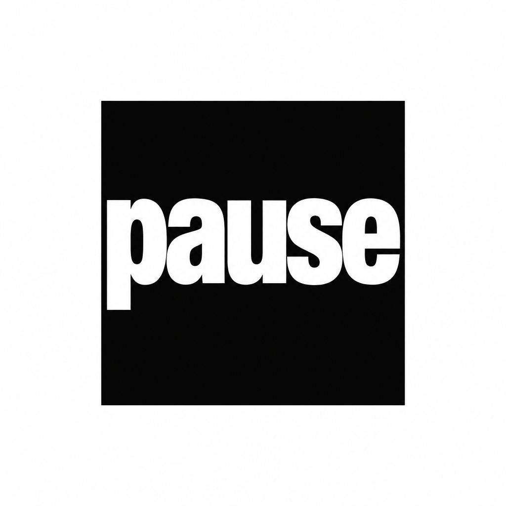
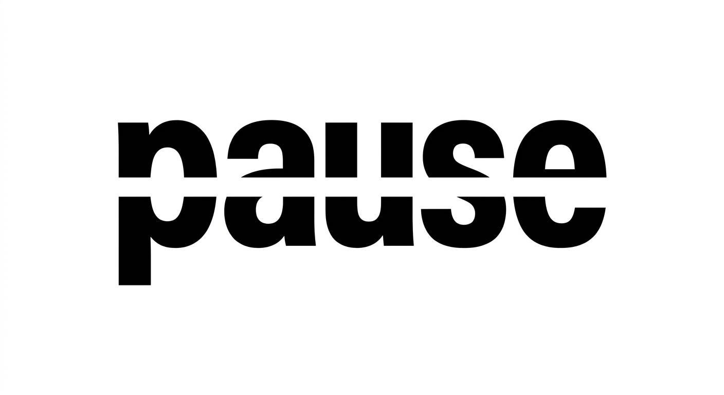
FinalistThe three words set lowercase and justified to one solid block, each line stretched to the same width with the leading pulled tight enough that the lines almost touch. The name becomes an object rather than a line of text.
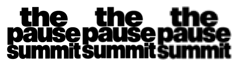
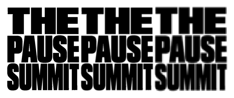
240, 120 and 64 pixels wideUpscaled with no smoothing, so anything that mushes is visible. The Meta ad thumbnail is the number one application.
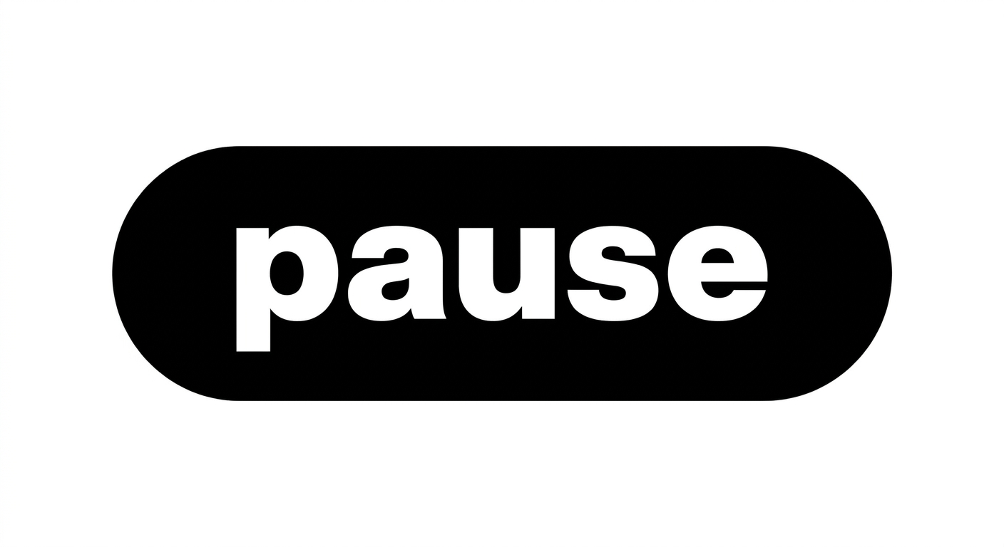
Reversed, one colourIf a mark needs two tones to work, it fails.
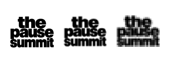
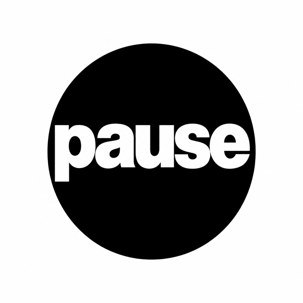
Avatar at 180, favicon at 64 and 32A square crop is where single-line wordmarks die.
ConstructionTwo vertical edges every line is justified to, and the horizontal band each line sits in. The block is the rule.
What holdsReads at 64 pixels wide. Survives one colour and reverses cleanly. Crops to a square avatar without losing the name, which is the thing a single-line wordmark cannot do.
What could go wrongThe block only works if every line is genuinely the same width. Set carelessly it looks like justified body copy rather than a mark, and the lowercase gives away less authority than the capitals do.
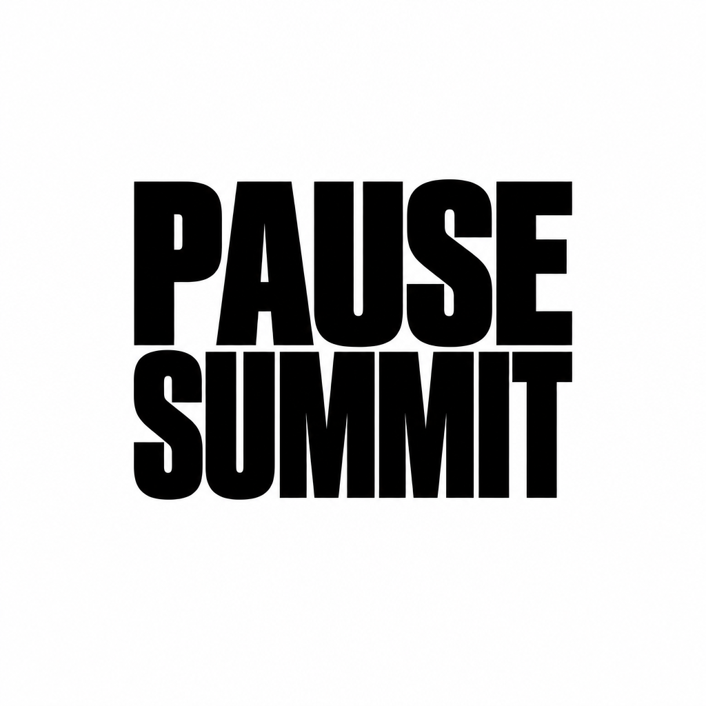
Capitals block
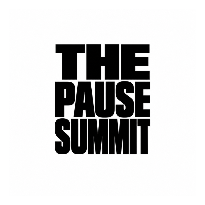
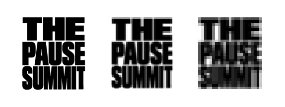
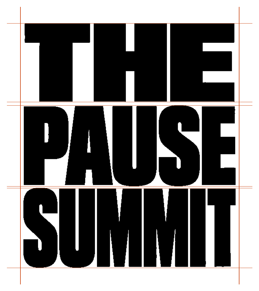
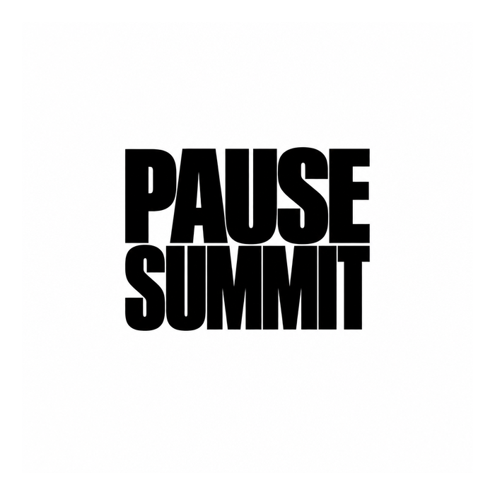
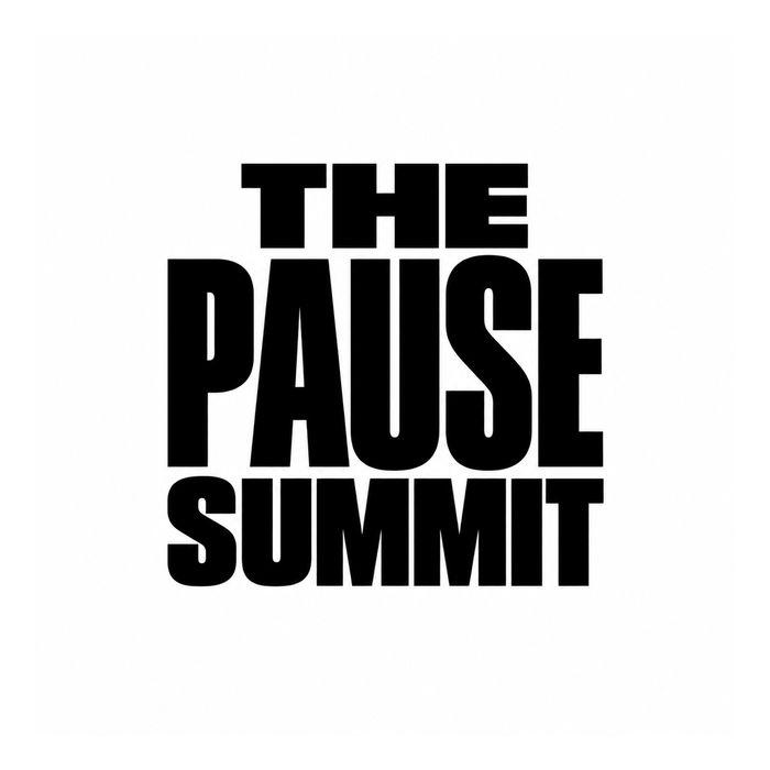
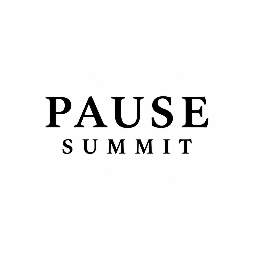
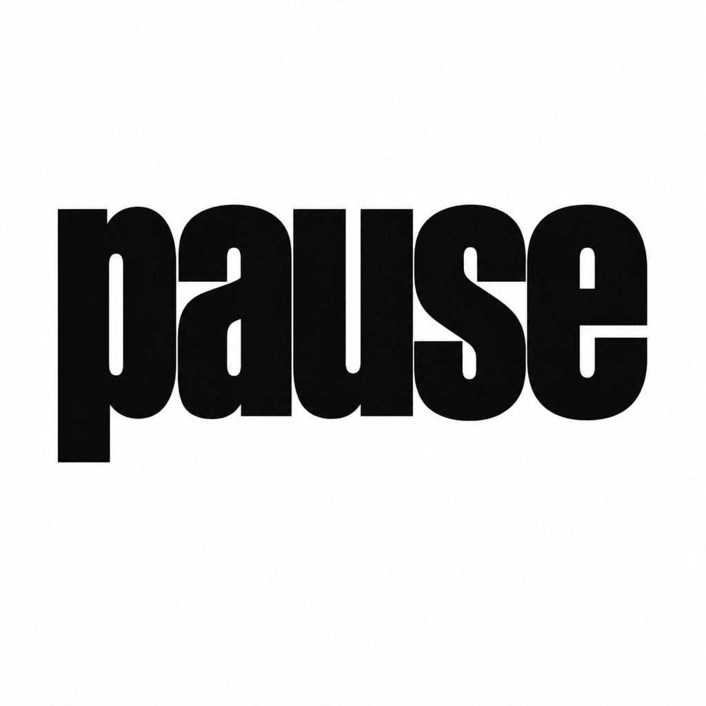
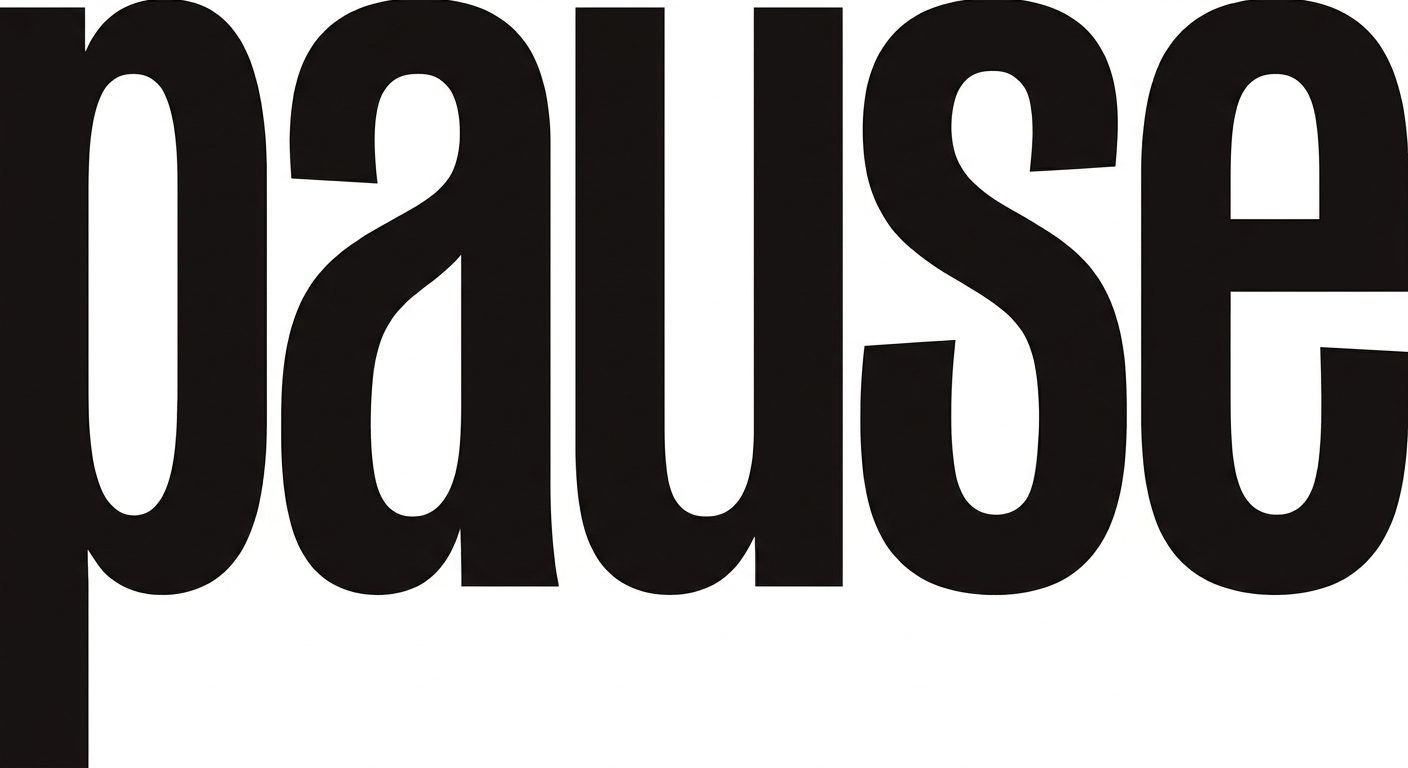
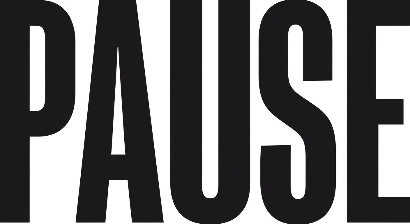
FinalistThe same justified block in heavy condensed capitals. This is the protest-poster register that Midi deliberately moved into to escape the pastels of women's wellness, and it is the furthest thing here from how the menopause category presents itself.
240, 120 and 64 pixels wideUpscaled with no smoothing, so anything that mushes is visible. The Meta ad thumbnail is the number one application.
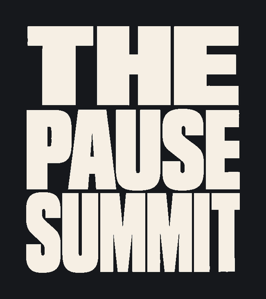
Reversed, one colourIf a mark needs two tones to work, it fails.
Avatar at 180, favicon at 64 and 32A square crop is where single-line wordmarks die.
ConstructionTwo vertical edges every line is justified to, and the horizontal band each line sits in. The block is the rule.
What holdsThe strongest of the three small. Condensed capitals keep their counters longer than lowercase, and the block shape stays legible as a shape even when the letters stop resolving.
What could go wrongLoudest option by a distance. Capitals can read as shouting at a fifty-five year old who is already tired of being marketed at, and condensed caps are one short step from a sports brand.
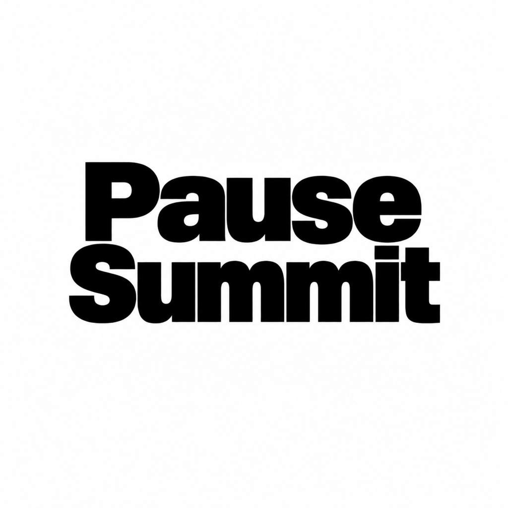
Word and rule
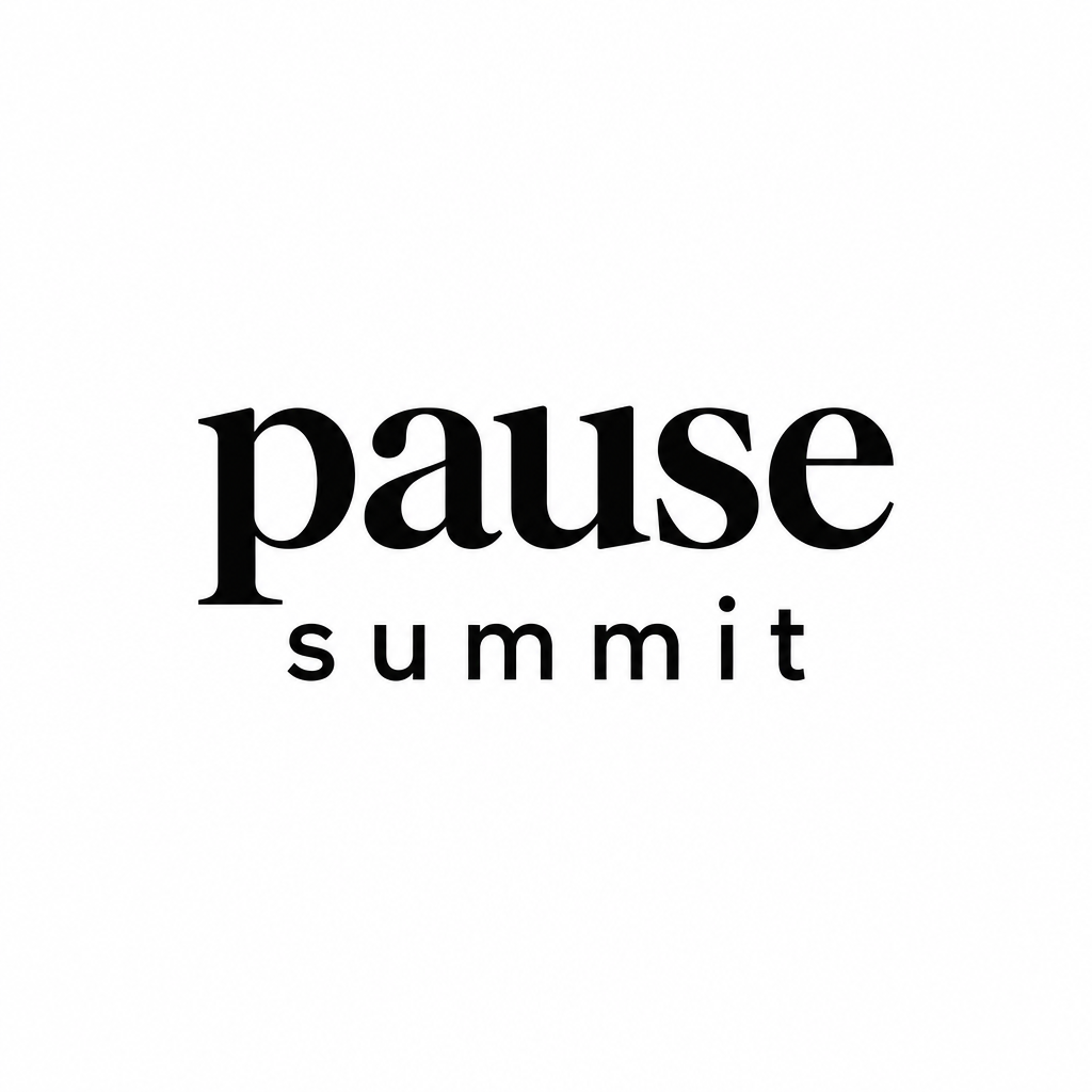
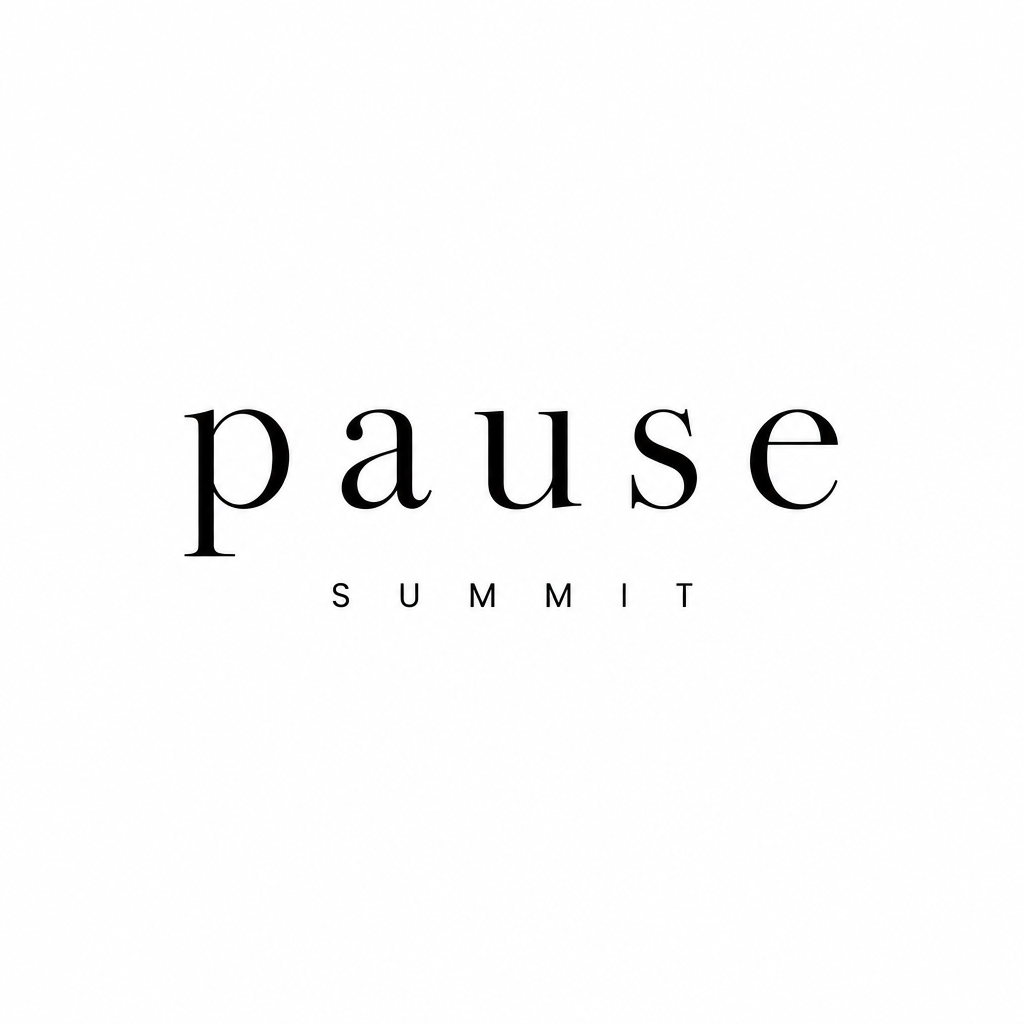
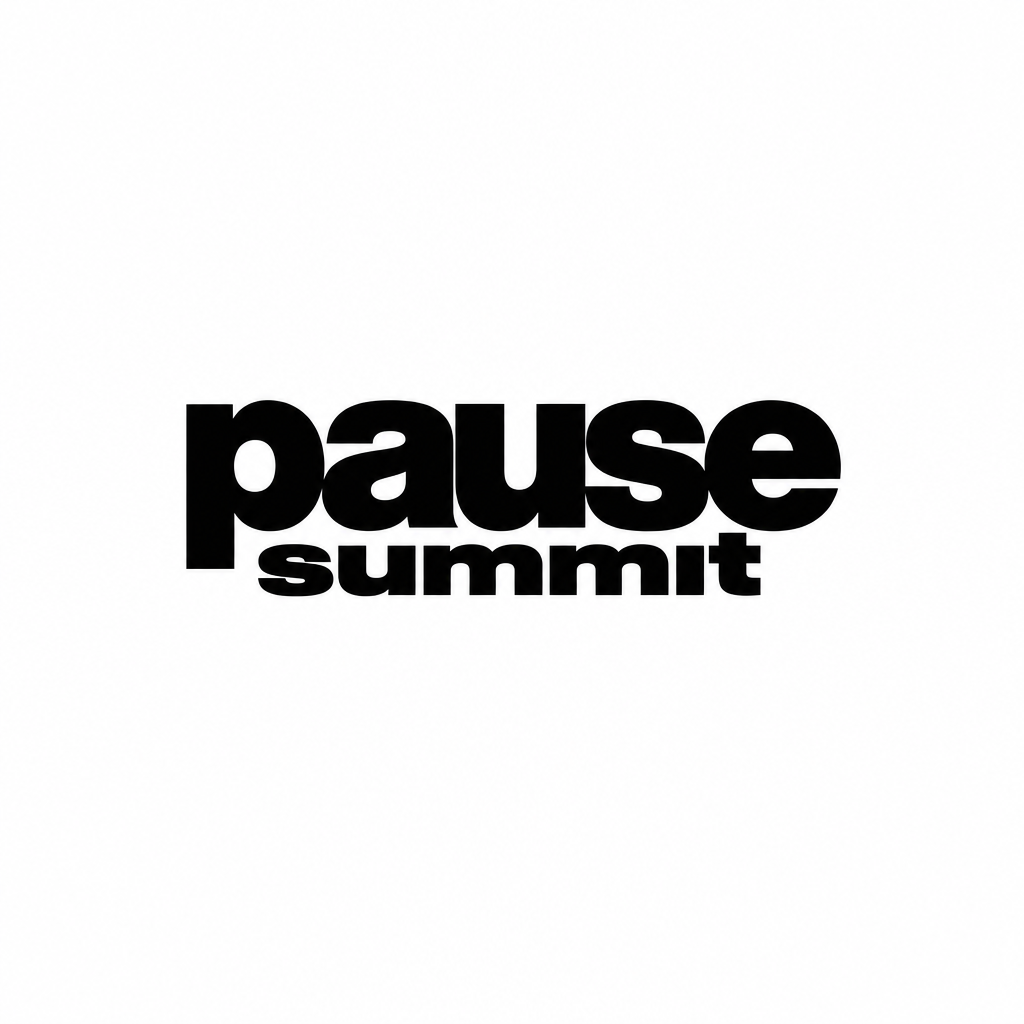
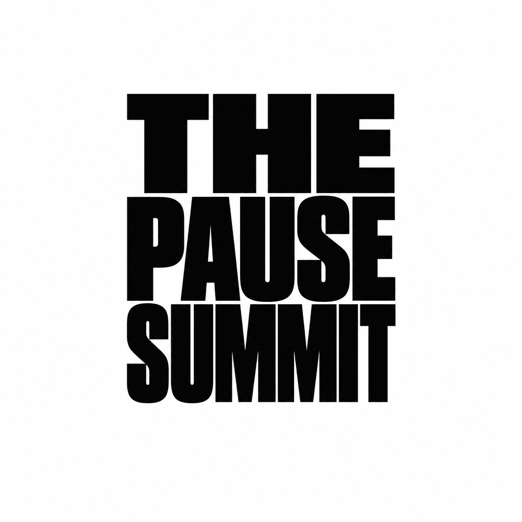
FinalistPause set large and condensed, with Summit letterspaced small beneath it to exactly the same width. The two lines are different in weight, size and spacing, so the hierarchy is unmistakable and the brand word carries on its own.
240, 120 and 64 pixels wideUpscaled with no smoothing, so anything that mushes is visible. The Meta ad thumbnail is the number one application.
Reversed, one colourIf a mark needs two tones to work, it fails.
Avatar at 180, favicon at 64 and 32A square crop is where single-line wordmarks die.
What holdsThe only finalist where the brand word stands alone cleanly, so Pause can be used without Summit wherever that is wanted. Most flexible of the three.
What could go wrongThe letterspaced small capitals underneath are one step from the category's wide-tracked caps camp. The spacing has to be clearly a device rather than a default.
Set against the category
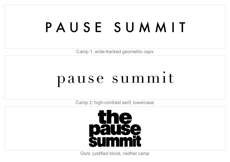
The audit found the whole menopause field sitting in two type camps. Below, those two patterns rendered generically, with our block underneath. These are the camps, not any competitor’s actual mark.
Camp one is Kindra, Joylux, Evernow, Pause Well-Aging and the Midlife Summit. Camp two is Alloy, Versalie, Stripes, Balance and Womaness. A justified heavy block is in neither, which is the whole point of it.
The explorations
Ten versions of the stack before the three above. Showing them is what makes the choice a decision rather than a preference.
A1Lowercase, justified block
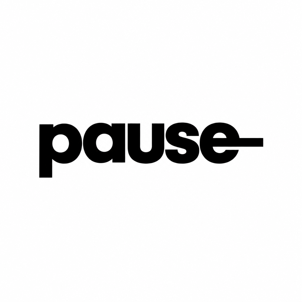
A2Lowercase, left aligned, pause larger
A3Lowercase, condensed, tall block
B1Capitals, justified block
B3Capitals, pause dominant
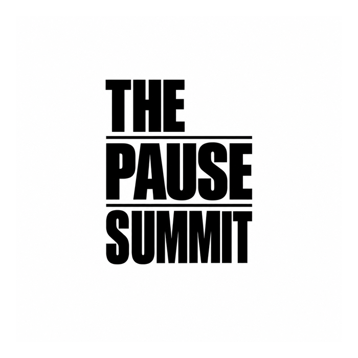
B4Capitals with rules between lines
C1Two lines, condensed lowercase
C2Pause large, summit letterspaced
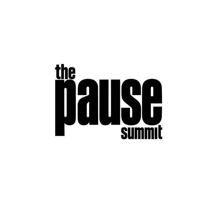
C3The and summit tucked around pause
Everything before this
Forty-six earlier directions, newest first. Kept so the shortlist can be argued with rather than taken on trust.